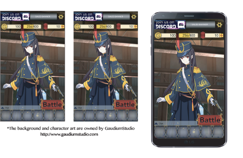
These are two of my earlier approaches to UX/UI. The first is an app being designed by GaudiumStudio that I designed my own interface approach to.
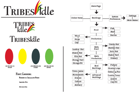
This is a clicker game I am working on with a friend of mine. He is helping me learn front end coding while I work on the art. It has been a great learning experience about what both the coders and the artists need to do to work together. He has taught me a great deal about the process of designing and coding a game from beginning to end.
For my own sanity, I did a quick map of all the buildings what they produce. I have sketches of map layouts, buttons, and how all the necessary information will be presented so that the user can easily see all the resources. I will upload these at a later date. If you are interested in viewing them now please email me.
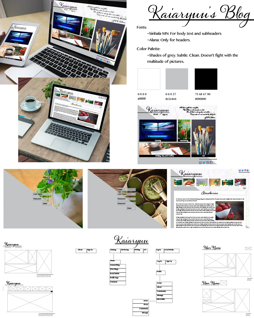
This was an interesting foray into a bloggers website sans adds. It was a personal project that I worked on to experiment with the transition between website, tablet, and phone. I specifically wanted it to look like a nice cookbook, but on a website. All the pictures I used are from pexels.com, which are free to use without attribution. Were I to make a real website, I would take these photos personally or hire a photographer. However, since there are so many photos, and they play an important roll in the design. My biggest challenge was keeping the design clean and simple so nothing vied for too much attention.
I chose the gray to break up the photos, but if I were to approach the project again, I would probably not use it, at least not as it is used now. While it was an intriguing idea for the login screen because the photographs can feel a little overwhelming at full screen, it does not work as well on the blog pages. I think if I were to use the gray again, I would balance the layout of the pages around it, so it doesn’t feel like an afterthought.
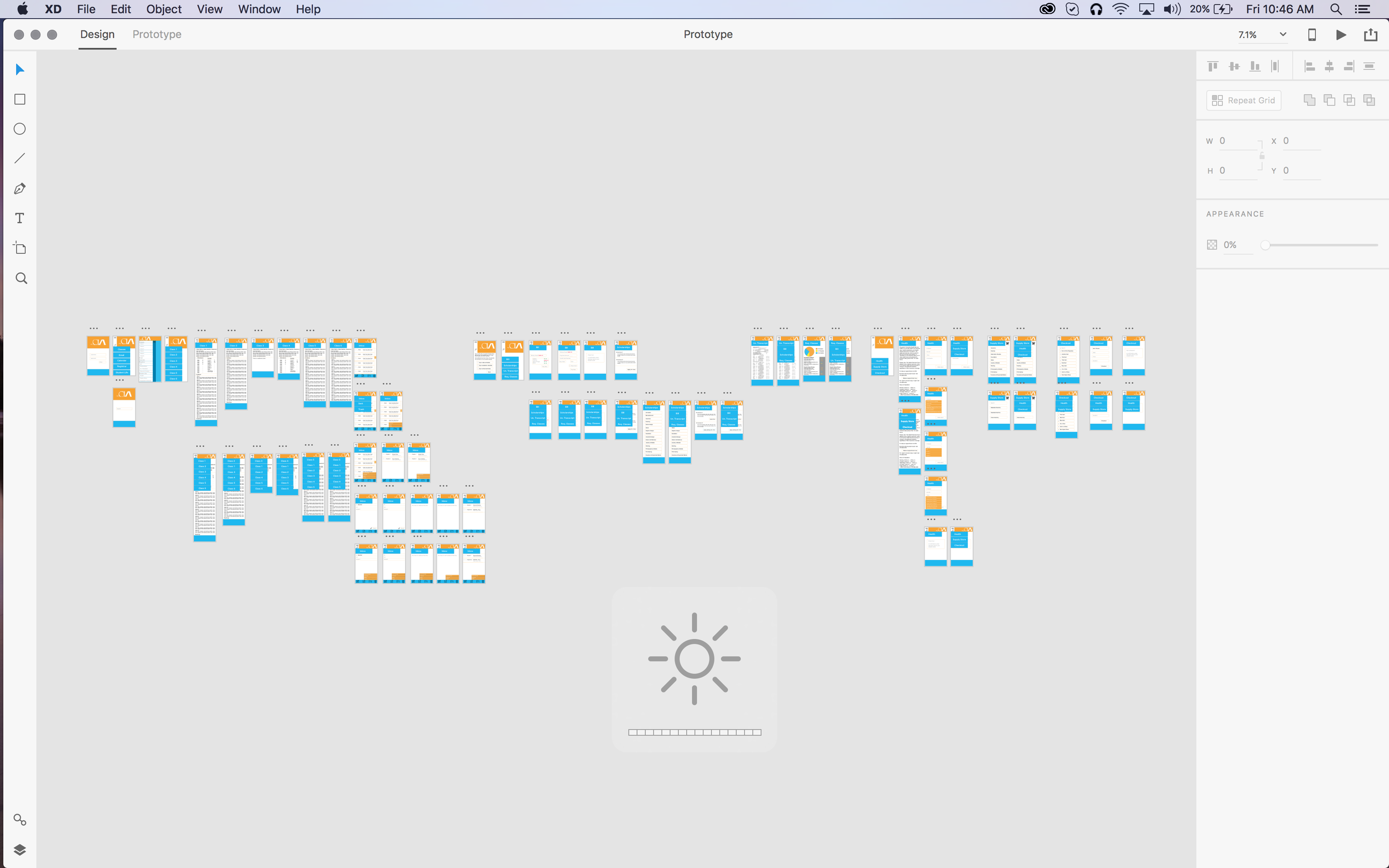
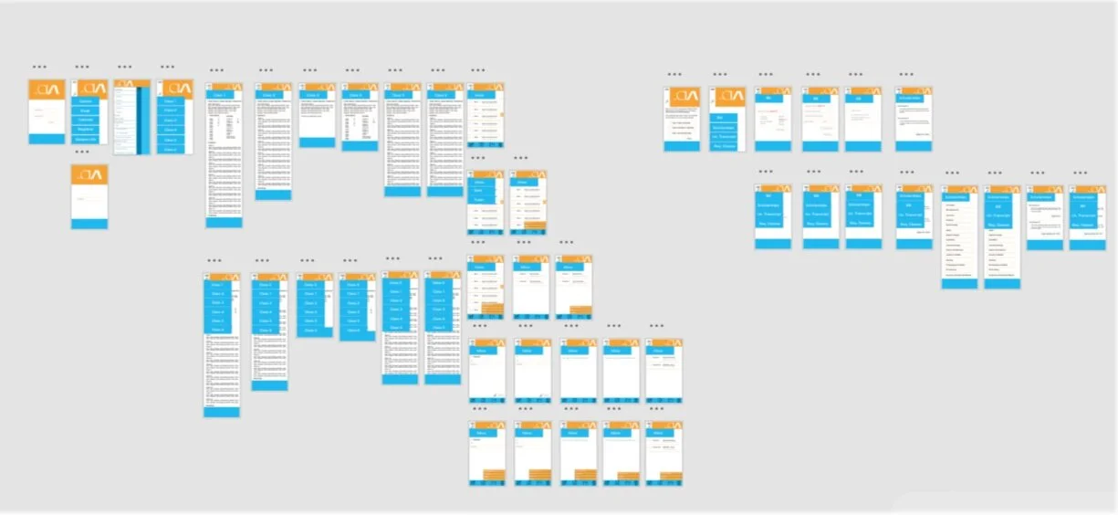
I have used both Adobe XD and Invision to create app prototypes. This particular app was a project where we were asked to design an app for the students at the Cleveland Institute of Art. I focused on easy access to class information and teacher communication. I interviewed students about what they felt they needed from the app and criticism or struggles with my app. The UX was the most important part of this process.
